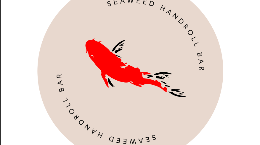
Seaweed Handroll Bar Menu Redesign
As the sole designer on this project, I led the complete redesign of Seaweed Handroll Bar’s menu system from concept development through final print production. The goal was to elevate the brand experience while preserving the visual identity that customers already associated with Seaweed. Rather than reinventing the brand, the challenge was to refine and mature it. I created a menu that felt more intentional, premium, and aligned with the quality of the dining experience.
2026
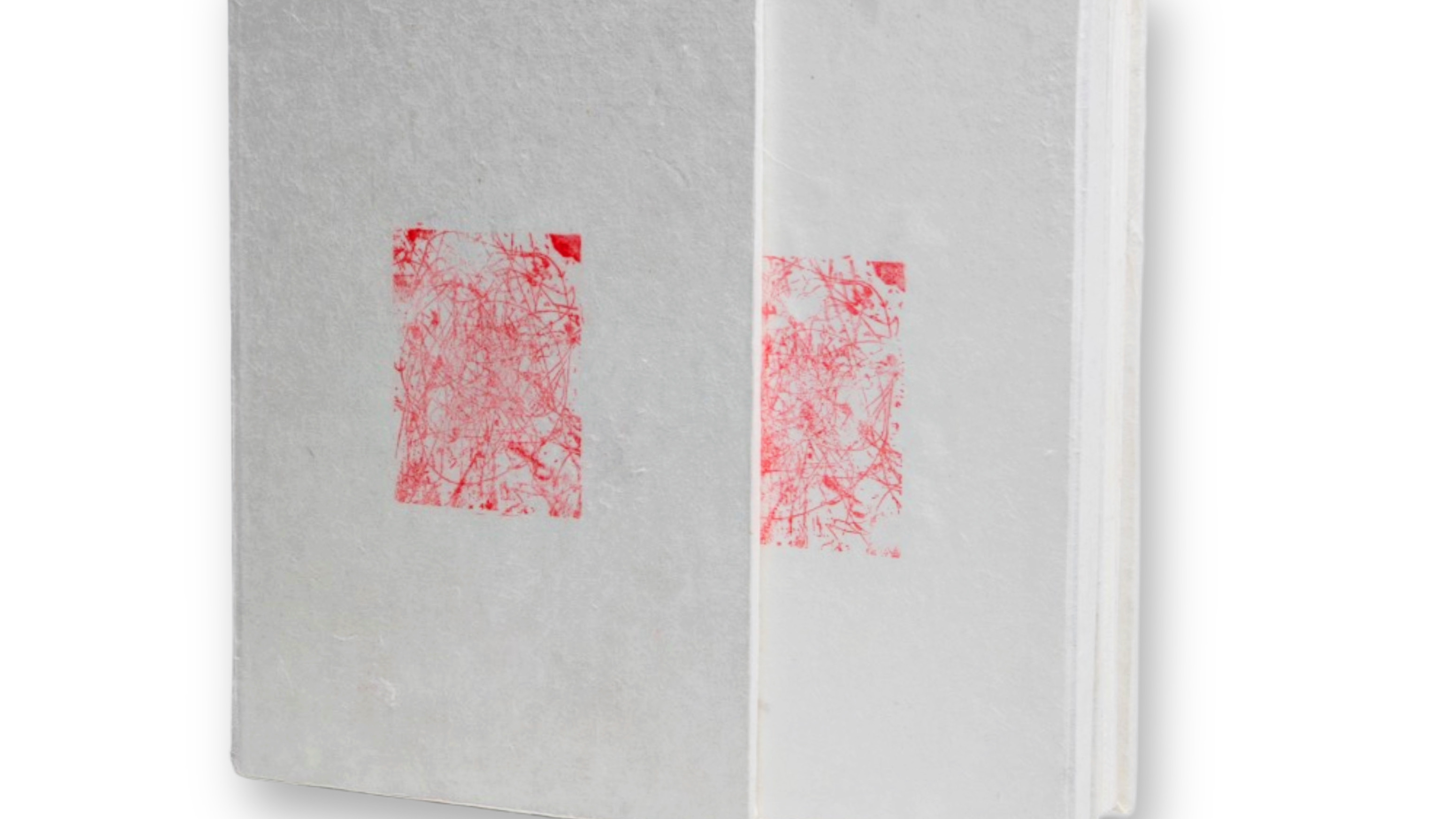
The Sound of Silence
The Sound of Silence is a handmade artist book that explores silence not as absence, but as a tactile, present force. Something you encounter through texture, rhythm, and material sensitivity. This project investigates how silence can be expressed through analog processes, inviting the viewer to engage with slowness, subtlety, and space.
The publication is entirely analog: all imagery is created through inkjet monotype printing, text is embossed into the paper rather than printed with ink, and supplemental imagery is applied using hand-carved rubber stamps. The book is bound as an accordion fold, allowing it to unfold spatially, suggesting motion through structure, not animation.
A companion book contextualizes the project with a concept statement, material explanations, and poetic reflections. The inclusion of poetry, some original and some found, mirrors the emotional nuance of silence, offering a second language for what cannot be explained directly. Together, these works ask readers to listen with their hands, to interpret through light, and to consider what it means to make space for quiet.
This project also reflects my personal relationship with silence: as a creative space, as a response to loss, and as a deliberate act of resistance to noise, both visual and cultural. The physicality of the work, its weight, its pressure, its fragility, asks for attention that is rare in a fast-paced world. The Sound of Silence is both an object and an experience: a quiet record of presence.
2025
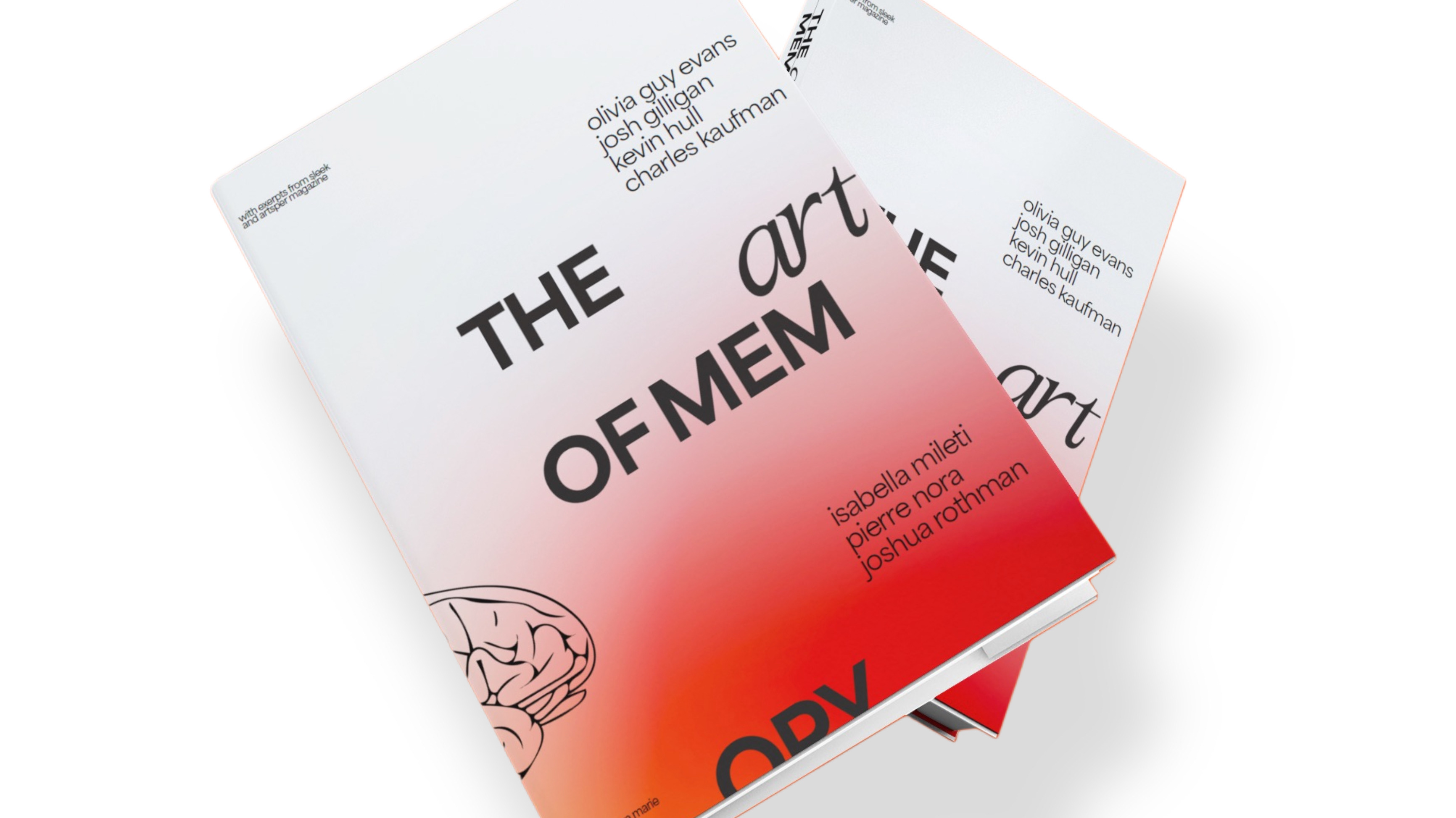
The Art of Memory
The Art of Memory is a designed publication that investigates the role of memory in the human creative process. Through a blend of research, visual exploration, and design experimentation, the book examines how recollection, nostalgia, and cognitive patterning shape artistic expression. The layout and typographic choices reflect the layered, fragmented, and often nonlinear qualities of memory, transforming abstract concepts into a tangible reading experience.
2025
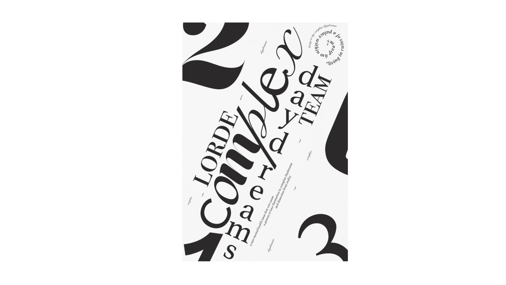
Typographic Poster
This typographic poster explores expressive type as both form and content, using fragments from Lorde’s Team to create a dynamic visual composition. By experimenting with scale, rhythm, and orientation, the design transforms language into a graphic landscape where words and numbers interact playfully yet deliberately. The result is an abstracted interpretation of music and lyricism, highlighting the power of typography to convey emotion, movement, and complexity beyond traditional reading.
2025
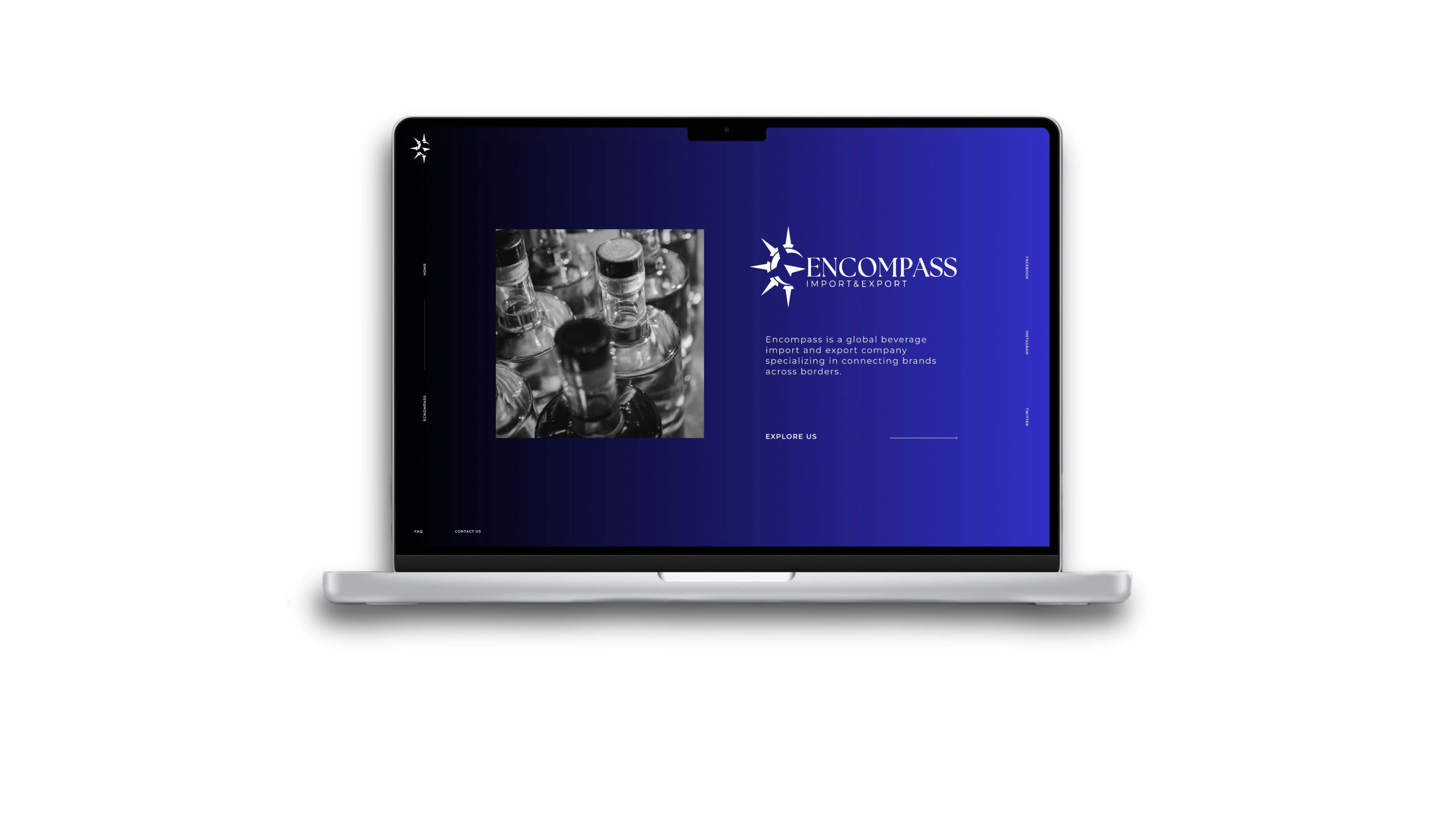
Encompass Beverage Distribution Website
This project involved designing a sleek, professional website for Encompass, a beverage distribution company, using Figma. The site was envisioned as both a brand showcase and a client-facing tool, highlighting Encompass’s products and services through a clean layout, intuitive navigation, and a modern design language. The result is a digital presence that communicates professionalism while positioning the company as a trusted partner in the beverage industry.
2025
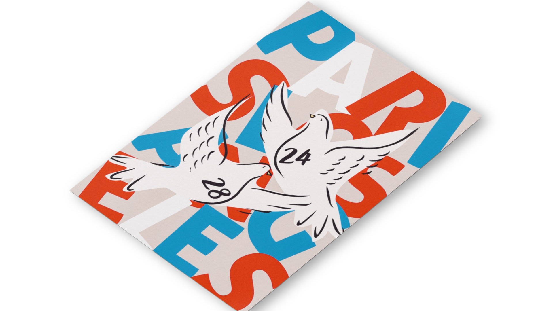
Olympic Poster
An official Olympics-sponsored student design competition in which art schools in Los Angeles and Paris were tasked with creating a poster and gif that commemorates both the 2024 Paris Olympics and upcoming 2028 Los Angeles Olympics. My submission was selected as Top 12.
2025
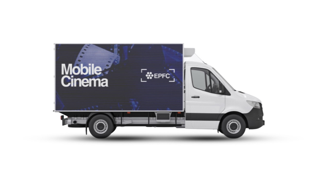
Mock Film Festival
This project reimagines Echo Park Film Center's brand and visual identity through a mock film festival. The goal was to create a more sophisticated and cohesive visual system, balancing the center's community-driven spirit with a polished design language. The resulting identity unifies typography, color, and imagery into a consistent visual language that elevates the festival experience while staying true to the center's independent voice.
2025
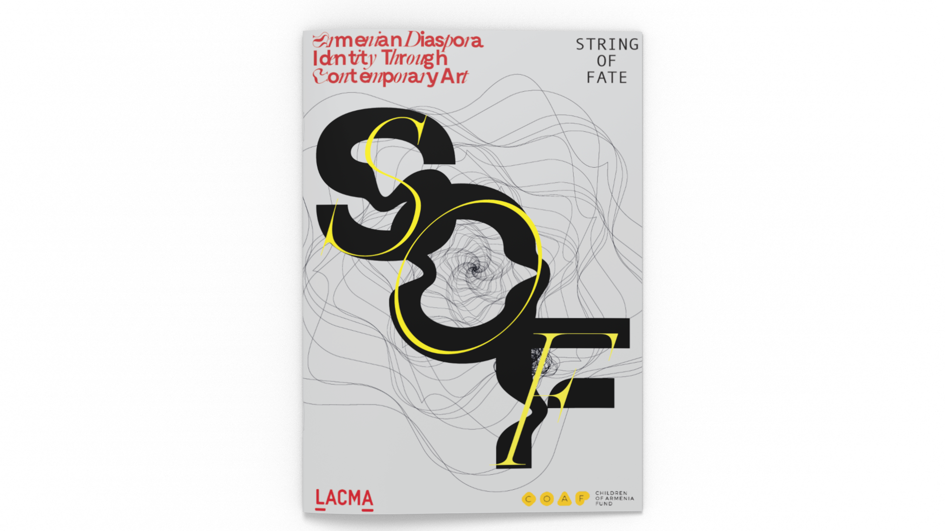
String of Fate
String of Fate is a curated mock exhibition designed for LACMA, centering on the work of Armenian diaspora artists. The exhibition weaves together diverse voices and practices, exploring identity, memory, and cultural resilience through a shared narrative thread. My role encompassed both curation and visual identity design, developing a cohesive system that reflects the elegance and depth of the artists’ stories while uniting them under a sophisticated, museum-ready presentation.
2025
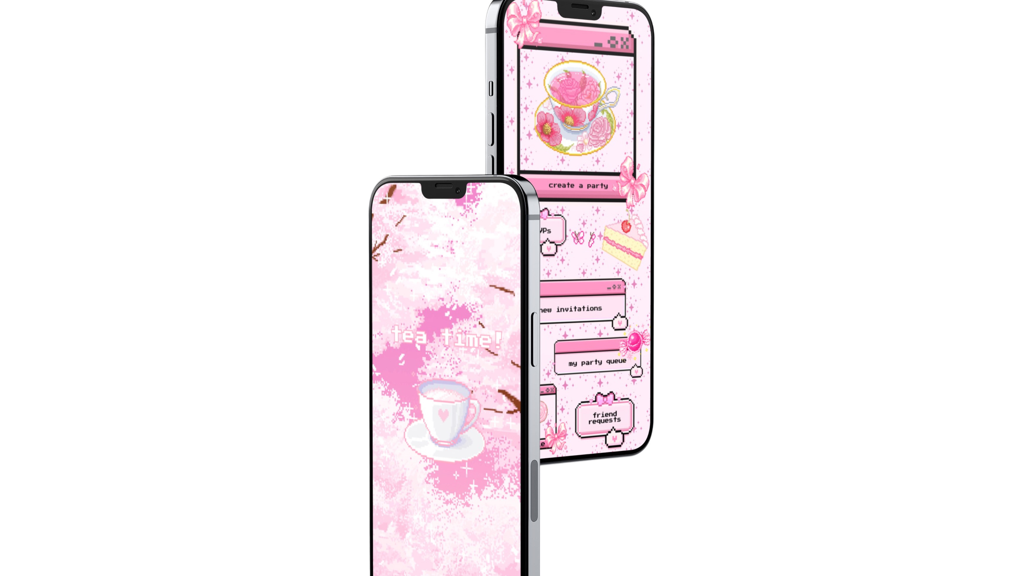
Tea Time
Developed during COVID-19, this app reimagines social ritual in a digital space, allowing members of the Japanese Lolita subculture to continue their tradition of afternoon high tea virtually. Inspired by a zine I created on Lolitas, the project translates the elegance and whimsy of the subculture into an interactive platform. Through carefully considered design, the app preserves a sense of connection and ceremony, blending nostalgia, fantasy, and technology into a shared experience.
2025
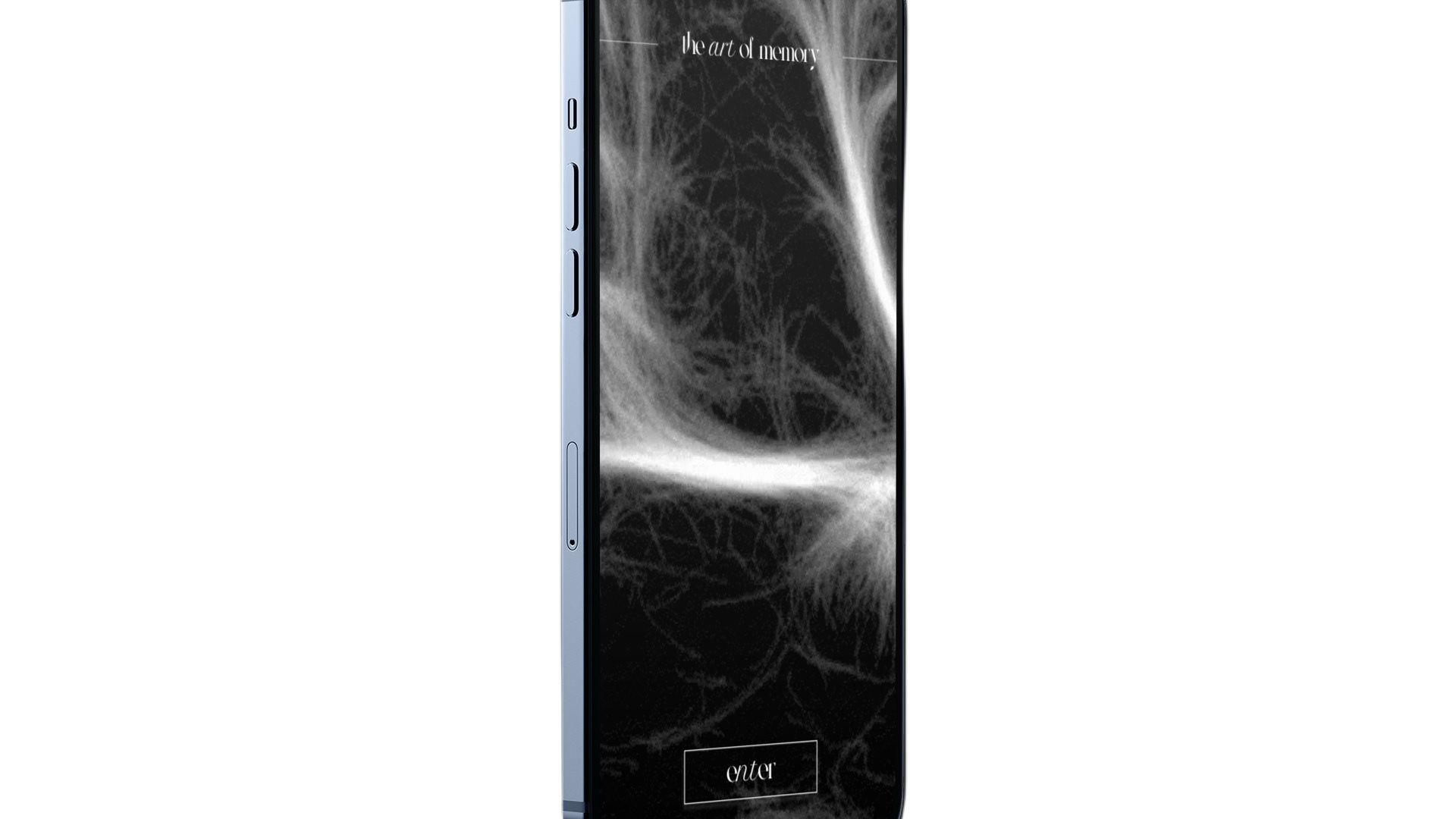
The Art of Memory - App
This app marks my first foray into digital product design, expanding on concepts introduced in my initial publication The Art of Memory. The project explores the relationship between memory and the creative process, translating abstract ideas about cognition into an interactive experience. By reimagining editorial content as a digital interface, the app investigates how design can shape the ways we recall, interpret, and engage with memory.
2025
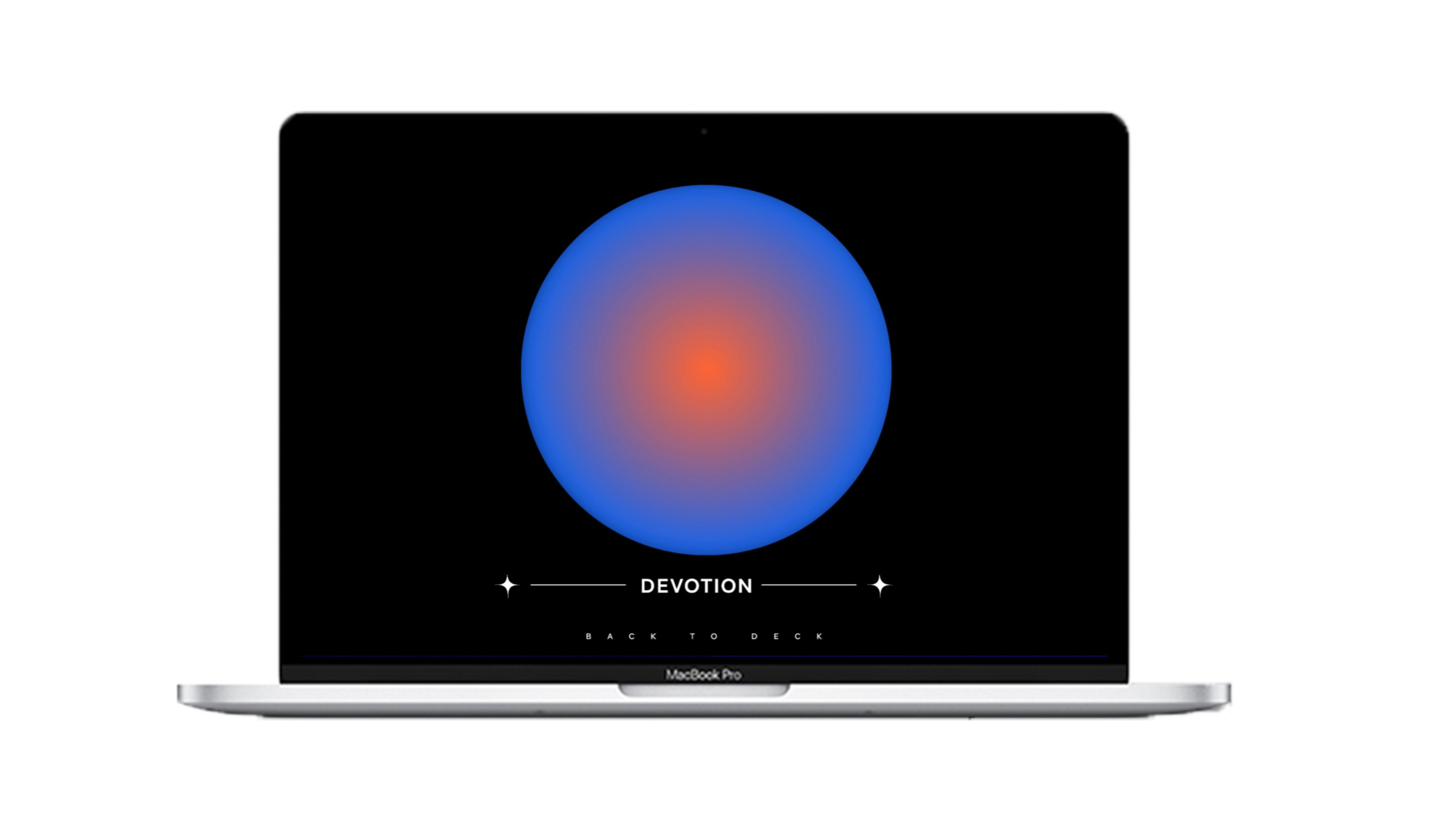
Divine Feminine Digital Oracle Deck + Guidebook
The Divine Feminine Digital Oracle Deck and Guidebook is an inclusive, multifaceted project designed to celebrate the wisdom, power, and intuition of the divine feminine in a way that resonates with individuals of all genders. My project consists of four key components: a digital oracle deck, a physical guidebook, stickers, and QR code cards for effortless access to the deck from anywhere. At the heart of the deck are uniquely crafted, AI-generated auras, created through a nuanced blend of code and creativity, which bring a modern, dynamic approach to the ancient practice of divination. The digital oracle deck offers convenience and accessibility, while the physical guidebook provides interpretations for each aura. The stickers serve as visual reminders of the deck’s messages, and the QR code cards seamlessly connect the physical and digital realms, ensuring ease of use. By incorporating AI as a collaborative tool, the project bridges technology and spirituality, offering a contemporary lens through which to explore inner wisdom, self-discovery, and the divine feminine archetype, while emphasizing accessibility, inclusivity, and the transformative power of intention.
2025
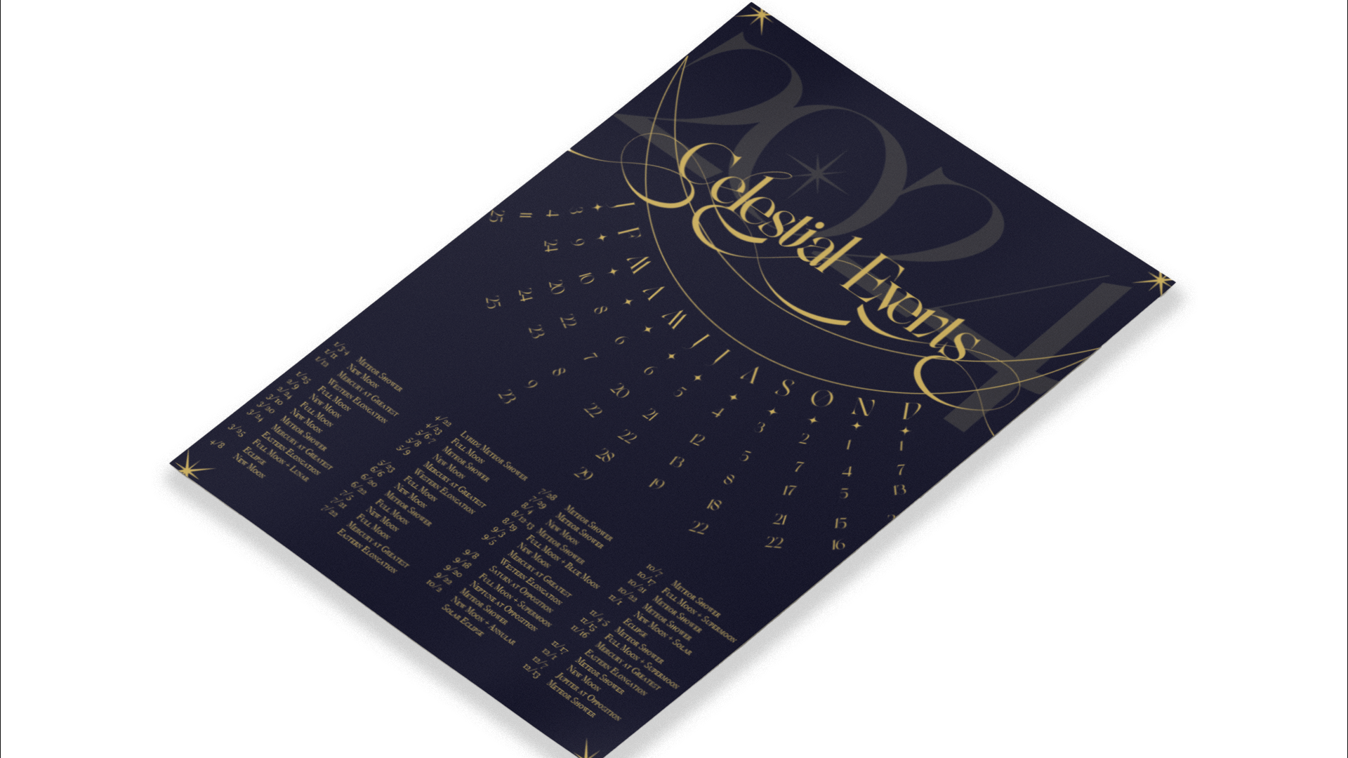
Celestial Calendar
This experimental calendar visualizes and tracks all celestial events occurring in 2024, from eclipses and meteor showers to planetary alignments. Designed as both a functional tool and an artistic object, the piece transforms astronomical data into a refined visual system that emphasizes rhythm, scale, and cosmic patterning. By merging design precision with a sense of wonder, the calendar invites viewers to engage with the passage of time through a celestial lens.
2025
Three Divine Gems Branding
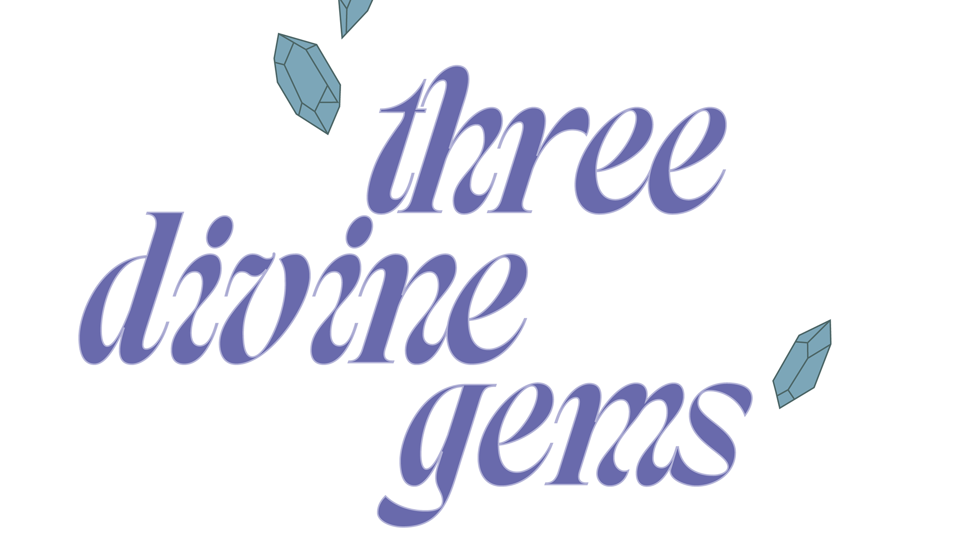
This project developed a brand identity and Shopify website for a woman-owned crystal company. The client requested a playful yet polished logo paired with a minimal, user-friendly digital experience. The resulting design balances whimsy with clarity, creating a brand presence that feels approachable and modern while offering customers an intuitive path to explore and purchase products online.
2025
USC ASDA Logo Redesign
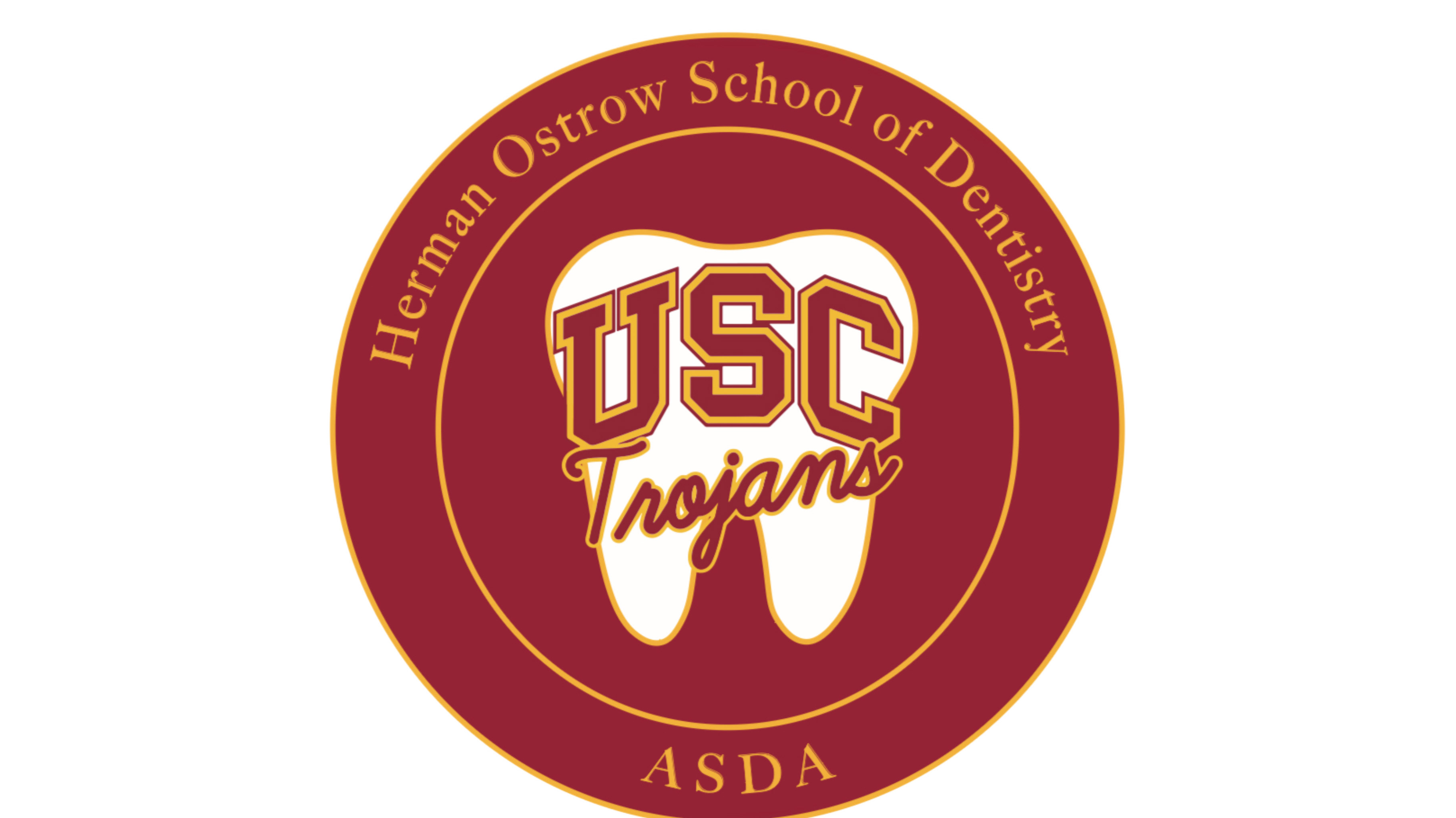
This project was the redesigning the logo for the USC Herman Ostrow School of Dentistry’s ASDA chapter. The redesign emphasizes clarity, professionalism, and a contemporary visual language that reflects both the school’s academic rigor and the student association’s collaborative spirit. By refining typography and symbolism, the updated identity strengthens recognition while presenting a more cohesive and modern presence.
2025
HQ Medical Billing Branding
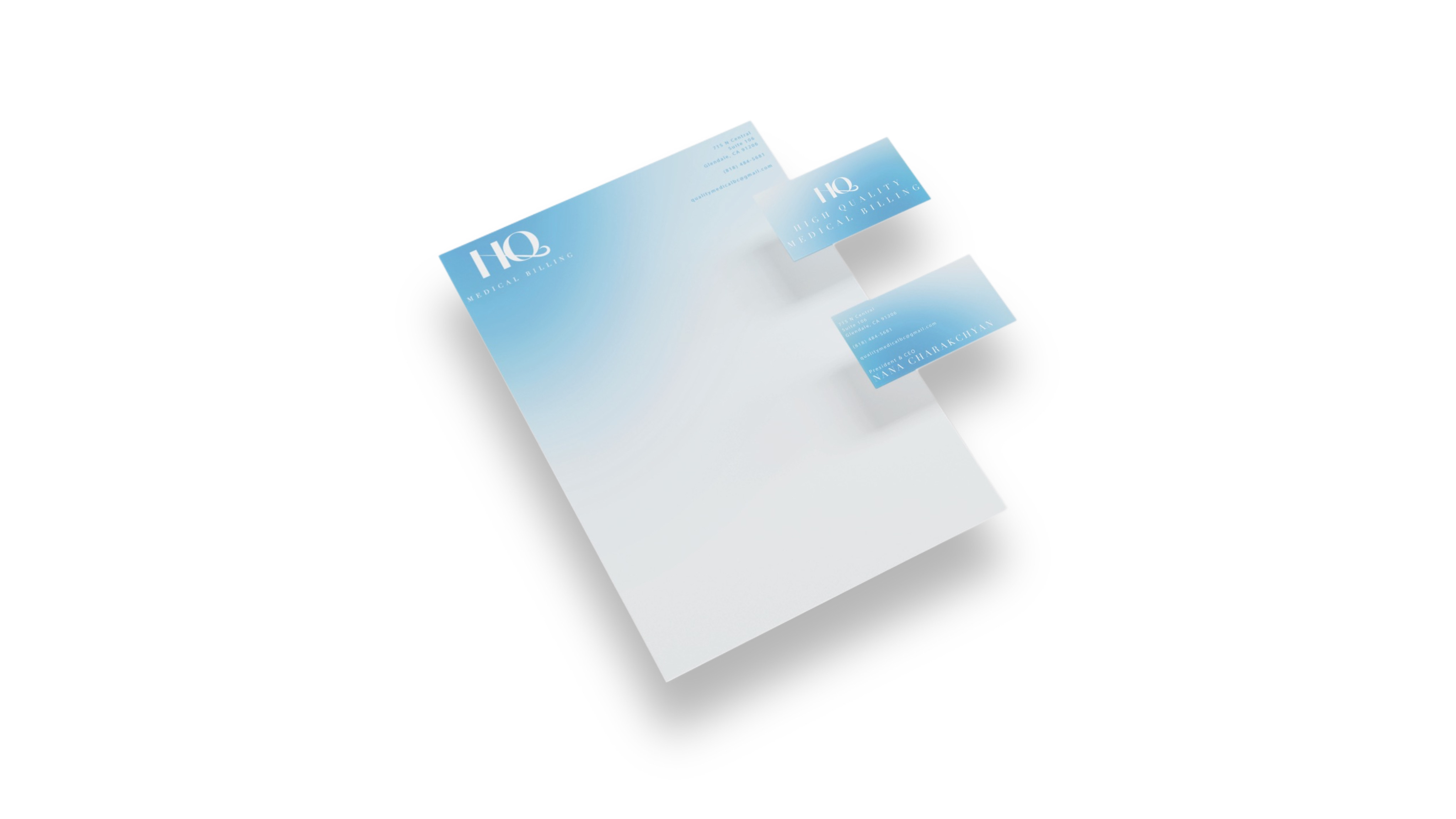
HQ Medical Billing is a fully woman-owned and woman-operated company that sought an identity balancing professionalism with a subtle feminine touch. The goal was to create a sleek, contemporary design system that feels at home in the healthcare corporate landscape while standing out through refined details and visual sophistication. The resulting identity emphasizes clarity, trust, and elegance, reflecting both the company’s expertise and the unique perspective of its leadership.
2025
HIDDEN
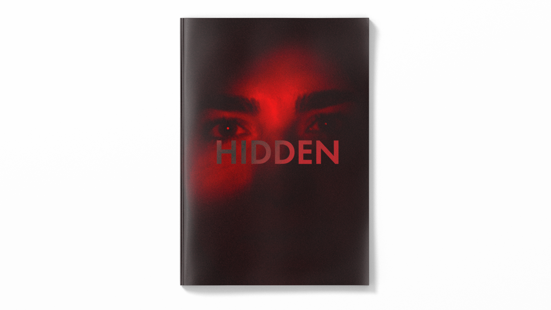
HIDDEN is a publication that takes a photojournalistic approach to the experiences of queer Armenian youth. Through original interviews and portraiture, the publication examines the ways LGBTQ+ identities are often concealed within conservative Christian Armenian communities and families. The design concept integrates hidden folios as a physical metaphor for concealment, mirroring the tension between visibility and erasure. The cover is interactive, revealing the subject's eyes when a tab is pulled, embodying the act of uncovering what is often forced unto hiding. By merging documentary photography with thoughtful editorial design, HIDDEN creates a space for voices too often obscured, while challenging cultural silences with intimacy and clarity.
2025